Monday, 29 April 2013

Ten Dollar Fonts Material

Here examples of material that demonstrates my typeface and how I would market it online:


-

A .gif that is perfect for screen, going through each letterform in detail on a constant loop:


Thursday, 25 April 2013

Potential job application

I have a friend whose sister is in the design industry. I need to send a CV and a portfolio through, so they need updating as soon as I can.


Friday, 19 April 2013

Studio Visit - How it Went

The chat with Si went really well. He was interested in the stuff that I was doing in my portfolio, whilst making some constructive criticism that would be helpful to improve my portfolio. Here are some of the main points:


  • Have variations of your portfolio that is tailored to the clients'/employers' needs. It is useless being a jack of all trades and a master of none.
  • Typeface is looking a little inconsistent in particular with the new characters. Some glyphs look out of place, but apart from that it is visually strong. Consider making various weights to make it more accessible.
  • Pictures need to be as visible as possible, possibly avoid the 6 images on one page. Break it up, and tell a story.
  • More of the brand needs to be evident on my Activ brief.
I made a follow up email to thank him for his time:


Also, I got the chance to contact Catalogue directly from outside the building. Unfortunately they were busy but I will follow this through via emails.

Wednesday, 17 April 2013

Crit Feedback 17/4


Overall, I am happy with the feedback. I found talking things through with my peers, rather than silently filling in a form helped the most. Here are the main concerns:

  • More primary research is definitely needed.
  • Expanding the range of the Nutharc typeface - more promotional material needed.
  • More scope for the Activ project. Push the product and distribution through ads/propose a launch event.
  • Including more photography within my projects.
  • Think about design for screen as well as for print.
  • Consider the audience more.
  • Personal colour palette could be limited, expand colour spectrum.


+++

Following the crit, we had a sheet to fill out and scan in. I opted to type my thoughts up as my handwriting can be diabolical at times.

Strengths
  • Typeface is looking strong with a good range of glyphs.
  • I have a product in the form of a font that I can market and sell.
  • The Activ campaign is a piece of design that can go in my portfolio and shows my capabilities at a commercial scale.
  • Iconography has improved.
Areas of Improvements
  • More work needs to be done in researching and idea generation for 3 briefs.
  • No real action plan at this point.
  • Activ brief could be pushed further. Last of my priorities, brief is finished as far as I'm concerned.
  • Need to start experimenting with stock choice and printing processes.

Action Plan
  • Push my Nutharc brief forward to create a set of deliverables that celebrate Nordic music.
  • Research more animals, create more icons for Endangered.
  • Get more movie scenes, icon up these scenes.
  • Finalise the yearbook.
  • Create typographic experimentations for the Bad Predictions brief.
  • Collect relevant photography & images for all briefs.

Studio Visit 18/4

I have a studio visit at Unit today at 3:00PM. Si Billam found the Leeds based company in 2010, and in that short time they have produced some very inspirational work. Here's how the conversation panned out:


I aim to update my portfolio with recent work as I haven't looked at it since January, which I will do tomorrow.

Friday, 12 April 2013

NUTHARC Font Development - Evaluation & Google Search


I'm done. All the relevant glyphs, numerals, letterforms and foreign characters is finished, adjusted and ready to be exported into a font file. Here is the final font table:


The only problem I have at the minute is the metrics. I still think work could be done, but I think it's time to call it a day. The perfectionist in me wants to continue, but I'm overriding these thoughts and finalising the font now. Otherwise, I will be here for another week, and I think I've spent too much time on it already.

I have given the final font to a few people to test out. I would say it's in the beta stage at the moment - it definitely needs testing. I will ask them if they can see any problems over the coming weeks, and I can always go back and make slight changes to it before making it available for download - which is something that I definitely want to do.

It's completely fine and usable for me to promote the font, make samples and typographic posters with, and to extend it into a tool for promoting the Nordic music scene - which is ultimately what I want to do, and the reason for making it key-able.

Short Evaluation

I thought it would be good to offer a short evaluation of my time with Fontographer 5, and to analyse the problems I had with the software along the way.

Firstly, it was much easier to get to grips with than I thought. The stories I had heard before were very negative, it seemed like a very frustrating piece of software to use. I found that if I imported the files in EPS format, it worked absolutely fine.

There were some problems with scale and proportions, but I found a way around that by including a scaled 'I' letterform with each glyph to ensure it stayed the correct size and weight for the font.

Overall, I think it has been a useful experience for me. I have spent a lot of, if not all, of the Easter period creating glyphs, getting to grips with the software and building an awareness of good font design and the metric system. I have come out with a product that I can market and sell, which I didn't have before, and have created more opportunities for my typeface to exist in the real world.

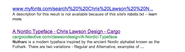
Out of interest, I googled 'Nutharc' to see what would come up. I have been featured on Luc Devroye's website, link below, of who I understand to be a Belgian-born computer scientist based in Canada. So that was nice.


I also noticed something interesting, a link to a search for 'Chris Lawson Nutharc 2013b' on My Fonts. Could be a glitch, but hopefully these points suggest there is some demand for my typeface, and is something I definitely want to build on through promotion and typographical specimens.


Thursday, 11 April 2013

Phone Scripts

Before the Life After College sessions I had written down a general phone script if I were to contact studios this way:


The phone that I have at the moment is not good for phonecalls. It is too quiet and I think I would seem unprofessional if I was consistently asking them to repeat what they were saying. Regardless, I think it's a good thing to have a plan just in case. Here is the revised script constructed in the Life After College session.